Um breve exemplo de Regression Discontinuity Design (RDD)
Nesse post, vou mostrar como estimar um breve exemplo de Regression Discontinuity Design (RDD).
Primeiro, baixe os dados aqui.
library(readxl)
library(ggplot2)
rm(list = ls())
dataRDD  <- read_excel("RDD.xlsx")
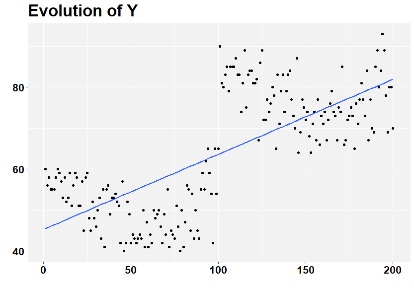
Veja o gráfico abaixo. Ao que parece, há uma discontinuidade nos dados em torno de x = 100. Isso sugere que, se ignorarmos essa discontinuidade, a associação entre x e y é positiva.
# Generate a line graph - Including all observations together
ggplot(dataRDD, aes(x, y))  +
  geom_point( size=1.25) +
  labs(y = "", x="", title = "Evolution of Y")+
  theme(plot.title = element_text(color="black", size=25, face="bold"),
        panel.background = element_rect(fill = "grey95", colour = "grey95"),
        axis.text.y = element_text(face="bold", color="black", size = 16),
        axis.text.x = element_text(face="bold", color="black", size = 16),
        legend.title = element_blank(),
        legend.key.size = unit(2, "cm")) +
    geom_smooth(method = "lm", fill = NA)
Vamos então separar as observações em dois grupos utilizando o valor de x = 100 como critério de corte.
  # Creating  groupS
  dataRDD$treated <- 0
  dataRDD$treated[dataRDD$x >= 101] <- 1

  # Generate a line graph - two groups
  ggplot(dataRDD, aes(x, y, group=treated, color = factor(treated)))  +
    geom_point( size=1.25) +
    labs(y = "", x="", title = "RDD exemplo")+
    theme(plot.title = element_text(color="black", size=25, face="bold"),
          panel.background = element_rect(fill = "grey95", colour = "grey95"),
          axis.text.y = element_text(face="bold", color="black", size = 16),
          axis.text.x = element_text(face="bold", color="black", size = 16),
          legend.title = element_blank(),
          legend.key.size = unit(2, "cm")) +
    geom_smooth(method = "lm", fill = NA)
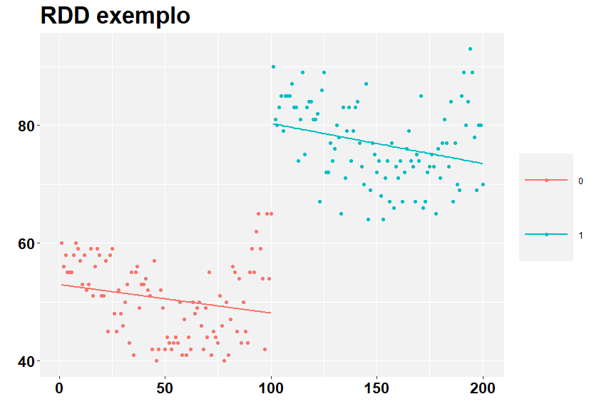
Agora, fica claro que a associação, em cada grupo de forma separada, é negativa.
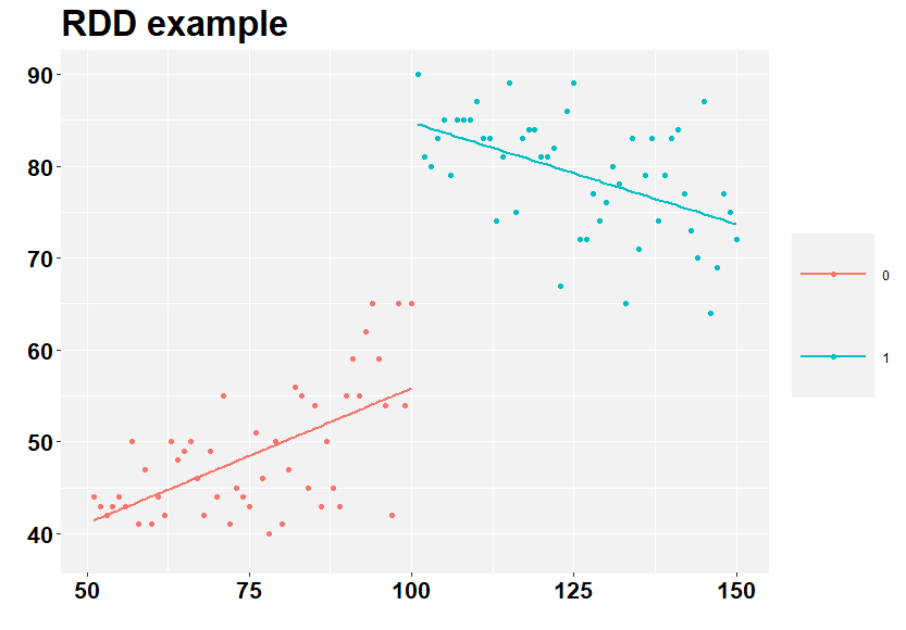
Vamos olhar, então, mais perto os valores próximos do corte.
# define cut
cut <- 100

# define the bandwidth - using 50 observations each side
band <- 50
xlow = cut - band
xhigh = cut + band

# subset the data for the bandwidth
data <- subset(dataRDD, x > xlow & x <= xhigh, select=c(x, y,  treated))

# Generate a line graph - two groups
ggplot(data, aes(x, y, group=treated, color = factor(treated)))  +
  geom_point( size=1.25) +
  labs(y = "", x="", title = "RDD example")+
  theme(plot.title = element_text(color="black", size=25, face="bold"),
        panel.background = element_rect(fill = "grey95", colour = "grey95"),
        axis.text.y = element_text(face="bold", color="black", size = 16),
        axis.text.x = element_text(face="bold", color="black", size = 16),
        legend.title = element_blank(),
        legend.key.size = unit(2, "cm")) +
  geom_smooth(method = "lm", fill = NA)
Olhando apenas 50 observações antes e após o corte, a associação antes do corte se torna positiva. Isso é algo que vamos querer levar em consideração em nosso modelo RDD.
Vamos então estimar o RDD.
# Regression  - not RDD yet (this is the result of the first graph)
rdd1 <- lm(y  ~ x   , data = data)
summary(rdd1)

# Generating xhat - Now we are going to the RDD
data$xhat <- data$x - cut

# Generating xhat * treated to allow different inclinations (we will use the findings of the last graph, i.e. that each group has a different trend.)
data$xhat_treated <- data$xhat * data$treated

# RDD Assuming different trends
rdd2 <- lm(y  ~ xhat + treated  + xhat_treated, data = data)
summary(rdd2)
Interpretação
Veja os coeficientes de cada regressão acima (você vai precisar rodar no seu computador). No primeiro caso, o coeficiente de x é positivo de 0.47, com t-stat igual a 13.72.
No segundo caso, o coeficiente de x, antes do cut e de 0.29 (t-stat 5.45) e após o cut de -0.51 (t-stat -6.75). Também temos o coeficiente do tratamento, que é medido pelo “salto” que ocorre perto do cut: coeficiente estimado de 28.9 (t-stat 13.11). Se esse fosse um exemplo real, esse seria o efeito causal de se ter recebido o tratamento (i.e., estar além do cut).
Aqui temos um caso bem simples e, acredito, bastante didático. Percebam que pode haver variações dessa equação estimada. Mas isso é conversa para outro post.
Abraços.
Please, cite this work:
Martins, Henrique (2022), “Um breve exemplo de Regression Discontinuity Design (RDD) published at Open Code Community”, Mendeley Data, V1, doi: 10.17632/4442xbw5ws.1