Thinking about Randomization
An exercise about randomization in experiments
This is a post about randomization when defining treatment and control groups in a randomized experiment. The conversation goes along the following lines: you need to be sure the group that receives the treatment and the control group are randomly selected from the population.
If you have doubts about randomization (for instance, if the distributions of relevant variables are not similar between the two groups), most likely, there will be confounding factors in your experiment. Thus, you may find significance in a coefficient and that the treatment “works”. However, your assessment of relevance would be incorrect.
What I mean is that your experiment will be biased if you do not randomly select the individuals that receive the treatment. Let’s discuss more in the example below.
Before we continue, I must say this is a simple exercise. We will not discuss covariates' balance between groups, and we will not draw strong conclusions about treatment validity. We only will see a randomization exercise.
The data
First, load the following packages.
library(readxl)
library(tidyverse)
library(dplyr)
library(ggplot2)
library(gganimate)
You need to download the data to your machine. Download it from here. Then load the file as below.
data <- read_excel("Randomization_data.xlsx", range = "A1:C101")
This dataset contains the variable of interest X. You can think of this variable as you prefer: headache, fat body percentage, firm value, etc.
You also have a variable stating the group of each individual. 50 individuals received the treatment, and 50 did not. The treatment can be a medicine, a new type of food, a corporate governance mechanism adoption, etc. Whatever you prefer thinking.
You also have in the excel file: each group X mean, the difference of means, and the t-stat of the difference of means. It seems that the treatment works, because the average of the treated group is higher than the control group, and, more importantly, the difference is statistically significant.
But here is the problem: whatever way you split 100 individuals into two groups, you will find a difference in X. Thus, how can you know whether the difference we see is a consequence of the treatment?
In other words, perhaps this statistically significant difference is a consequence of my selection of individuals, not a result of the treatment. Maybe I am selecting the individuals with higher X in the first place (or maybe, I am selecting individuals with covariates that increases the likelihood that X increases after the treatment)…
Well, if we suspect that the individuals are not randomly selected, then our experiment is in trouble. Keep that in mind!
Ok, to be cool, let’s check for a moment these differences in a box plot.
ggplot(data, aes(y=variable, fill=Group)) +
geom_boxplot()+
labs( y = "", x="", title = "Boxplot of variable X - Control and Treatment groups")+
theme(plot.title = element_text(color="black", size=30, face="bold"),
    panel.background = element_rect(fill = "grey95", colour = "grey95"),
    axis.text.y = element_text(face="bold", color="black", size = 18),
    axis.text.x = element_blank(),
    legend.title = element_blank(),
    legend.key.size = unit(3, "cm"))
This is the figure you will find. It shows that the treatment group has a higher mean of variable X than the control group. This is the expected result should the treatment works. The figure illustrates the findings of the previous analysis in the excel file.
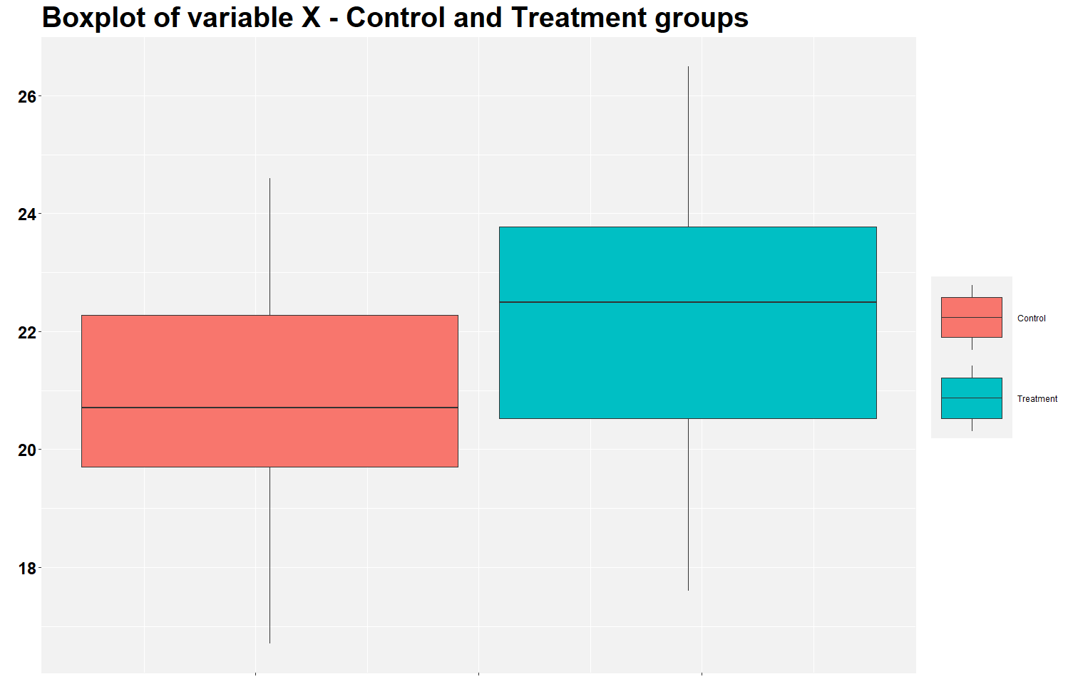
But let’s calculate the mean difference between groups using the row below. Notice that the average X in the treatment group is 1.47 (22.27 - 20.80) higher than in the control group.
tapply(data$variable, data$Group, summary)
Finding a positive mean difference is expected, but is this difference statistically significant? Let’s check using the row below.
t.test(variable ~ Group, data = data)
It seems the difference is significant since the p-value is 0.0003258. Same as in the excel file.
Randomization exercise
Now let’s start the nice stuff. We’ve seen that the treatment seems to work since the difference is statistically significant. But how can we verify if this low p-value is a consequence of my selection of groups? I.e., perhaps the p-value was found by chance? Well, we can proceed to a simple randomization exercise.
The idea of this exercise is to split the 100 individuals into two different groups in a random way. We will separate them not based on the initial treatment status (the one in the original excel file), but we will allocate individuals into groups randomly. Then, we will calculate the difference in means of these two new groups and compare it to the 1.47 difference of the initial groups.
In fact, let’s not create only one new combination of groups, let’s create 25.000. You may change the row below to the number of groups you want to create.
comb <- 25000
Then, let’s create a data frame to include the new mean differences that we will calculate below. We have 25.000 new combinations, thus we need a data frame with 25.000 rows to store each unique mean difference into a row.
df <- data.frame(matrix(ncol = 2, nrow = comb))
colnames(df) <- c("order" ,"diff")
The loop below is where the magic happens. We are creating the 25.000 new groups using a random number generator process.
Suppose that you do not trust how I selected the treatment and control groups in the excel file. One way to assess my selection is by calculating the likelihood that given 50 individuals would have 1.47 higher X than the remaining 50.
If several combinations of 50 individuals show a difference higher than 1.47, perhaps I did not randomized the groups properly in the excel file. So, the significance that we found above was just chance.
But if the likelihood of finding a difference higher than 1.47 is low, then perhaps I selected them randomly, and the treatment likely works. We will not make strong hypotheses by now, but let’s check this story.
DISCLOSURE: I am using the set.seed() function; thus, in theory, you should find the same mean differences as myself. But I am aware that this function sometimes does not work as it should, so you may find slightly different numbers. If anyone finds an error in how I am using this function, please let me know.
for (i in seq(from = 1 , to =comb )  ) {
set.seed(i)                               # setting seed to ensure reproducibility
data$temp <- runif(100, min = 0, max = 1) # creating 100 random numbers 0 to 1
data <- data[order(data$temp),]           # sorting data by the random numbers generated in previous row
data$rank <- rank(data$temp)              # ranking by the random numbers

# The row below define the treatment group based on the random numbers generated. This is where we guarantee randomization
data$status_rank <-  case_when(data$rank <= 50 ~ "Control_rand", data$rank > 50 ~ "Treated_rand")

# Calculate the new means of the new groups. Need to transpose data.
means <- t(as.data.frame(tapply(data$variable, data$status_rank, mean)))

# Moving the new means to df. Each row is the difference of means
df[i,1] <- i
df[i,2] <- means[1,2] - means[1,1]

rm(means) # Deleting value
data = subset(data, select = -c(temp,rank,status_rank)) # Deleting variables
}
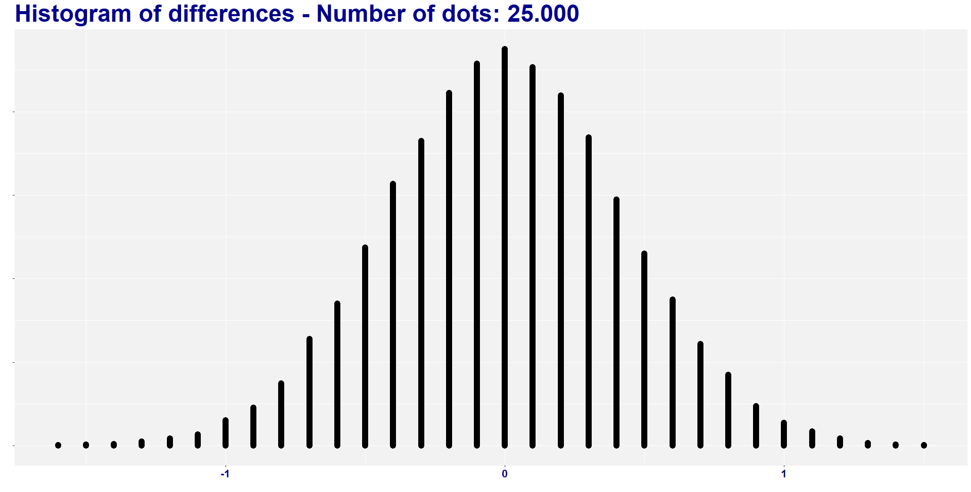
I found two combinations of groups with a difference lower than -1.468, and six combinations of groups with a difference higher than 1.468. So, eight out of 25.000 combinations (i.e., 0.032%) have absolute difference higher than the original one. In other words, the absolute average difference is way lower than the 1.47 difference that we find in our treatment.
sum(df$diff < -1.468)
head(df$diff)

sum(df$diff > 1.468)
tail(df$diff)
Before delving deep into the meaning of all this, let’s create a histogram to visualize the distribution of the 25.000 new mean differences.
count_data <- df %>%  mutate(x = plyr::round_any(diff, 0.1)) %>%
group_by(x) %>% mutate(y = seq_along(x))

ggplot(count_data, aes(group = order, x, y)) + # group by index is important
  geom_point(size = 1) +
  labs( y = "", x="", title = "Histogram of differences - Number of dots: 25.000 ")+
  theme(plot.title = element_text(color="darkblue", size=35, face="bold"),
    panel.background = element_rect(fill = "grey95", colour = "grey95"),
    axis.text.x = element_text(face="bold", color="darkblue", size = 16),
    axis.text.y = element_blank(),
    legend.title = element_blank())
What do we learn?
We learn how to think about randomization in an experiment. This exercise shows us that we need to be sure that we are not selecting groups that are different by nature. For instance, we cannot select a sample of basketball players to calculate the average height of a population. We cannot select the top X individuals to compare their average X with the bottom X individuals. And so on.
You have to select randomly the individuals that will participate in the treatment. Like flipping a coin, or tossing a dice.
Finally, it is important to recognize that something is missing in this exercise. When dealing with experiments, it is essential to control for some pre-treatment characteristics in individuals (i.e., calculate individual-level variables, such as age, firm size, etc.). We are not doing this here. Thus we cannot be sure if any confounding factors may be leading the treatment result. In this exercise, we only observe X. It is not enough to fully evaluate the experiment result!
I hope you like this exercise. Let me know if you have any questions.
Thanks for passing by.
Please, cite this work:
Martins, Henrique (2022), “Thinking about Randomization published at Open Code Community”, Mendeley Data, V1, doi: 10.17632/2ttnmmss6p.1